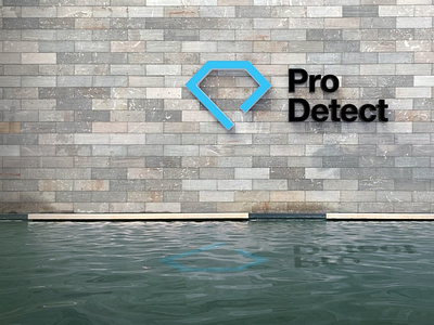
Pro Detect Logo - Concept 3
“DIAMOND-P” – SIMPLICITY/CLARITY
Diamonds are clear (mostly) and the logo has been illustrated in the simplest way possible, a single line (forming the shape of a “P”).
This design is inspired by Swiss design (strict adherence to the grid, asymmetry & sans serif typography).
Helvetica has been used as it is the quintessential Swiss typeface, additionally, the type-layout builds upon the grid and amplifies the simplicity of the mark.
Telling the customer the service is clear and simple.
More by Picnic Designs View profile
Like
