Deleting a graph idea
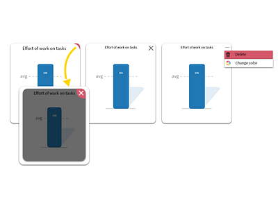
Hi everyone, I stumbled upon this idea a while ago. I wanted to make an intuitive deleting experience of a graph on my newly designed dashboard. This challenge has proven to me two things. One that something intuitive for me is not necessarily intuitive for the other one, and second that even the basic things can take up a lot of time.
I personally wanted to make work the first option which is when you hover over to the top right corner, the little red space will slide out containing the white cross for you to delete the graph. The second one and third one are pretty much self-explanatory.
The idea behind the first one is that for the work, you don't have to always see the cross on the top right corner, but you have that little redlining for you to remember that if you go to that place, the option to delete this graph will pop-out.
Let me know if this is intuitive for you as well, and if not tell me how could I improve this idea, or if I should head totally the opposite way.
Share with us your thoughts. :D
I always appreciate the feedback, so don't be afraid and tell me everything. :)
Have a nice day.
