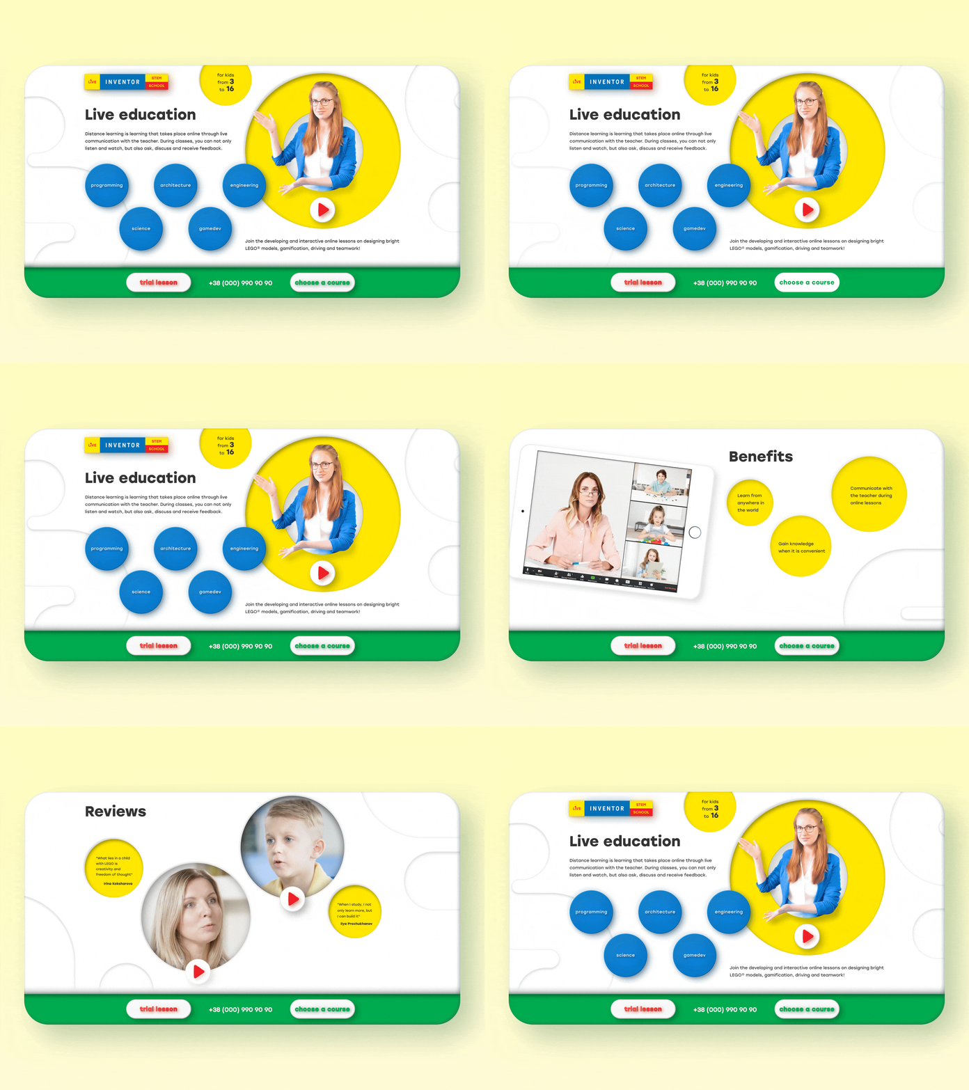
Flacky style landing page
The task was to create the design of the landing page for review and registration for online lessons. The landing page was supposed to have simple and understandable functionality and clearly describe the benefits of both online education and specific lessons. The design had to be fresh and in line with the brand book. A layered structure was chosen to visually separate the content. All elements that are above the surface are clickable, those that lie on the surface or on the bottom layer are not. For this, a Flacky style guide was developed. You can view the guide and download style elements for Figma by the link bellow: https://www.figma.com/file/pYj4vk3BfGEiZ4kqUgrSeR/Flacky.-Guide Video on the front page helps tо learn more about online education and enroll in a course.
