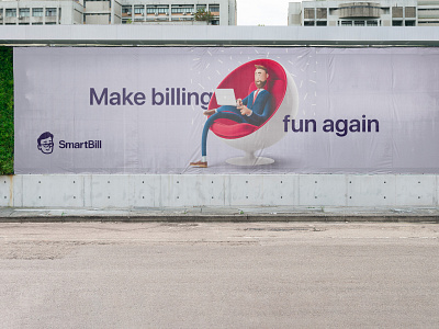
Smartbill billboards
A while ago SmartBill (smartbill.ro) redesigned their brand. They decided to stop using their mascot and adopted an abstract monogram. As a long-time client of theirs, I was disappointed to see it go. Completely ditching a graphic element that accumulated years of brand equity didn't make sense to me. It also seems that the new graphic solution is much less creatively-flexible (harder to design something original with). I decided to take a stab at fixing it. Instead of abandoning the mascot, I thought I'd build on it. Here's how it turned out. What do you think?
More by Contrast Studio View profile
Like


