DailyUI #065 - Notes Widget
Zoom-in (click image) for better image quality.
Good day Dribbblers 👋
This is my #065 #DailyUI design. 📝📓✒️
Design Hint 💻 No design hint today... 😔 Where are these disappearing off to? 😅
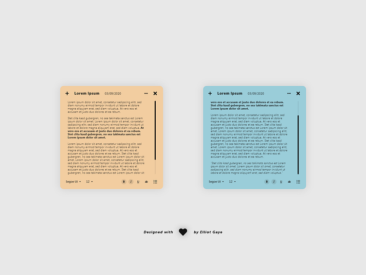
The Idea 💡 The idea for todays UI design is a notes widget app for desktop. The widget will feature a large square space fore text input, scroll functionality, titles, dates, and text options such as font size etc. The design will be vibrant and spaced, with a colourful preset colour palette, along with predominantly Black UI elements lying above.
Final Thoughts 🧠 It's a small, simplistic, neat and handy notes widget. For it's small squared dimensions, the widget makes space for all the vital and useful tools anybody could and would need for a widget of this nature.
Near the top of the widget the user has the options to add/create a new note, change the title of the current note, use a drop down to change the notes background colour and delete the note, and close the widget down using the cross. Near the bottom of the widget the user has the options to change the text font, font size, toggle bold/italic/underlined/strikethrough of text, and assign a bullet point list. The user can input as much text as they'd like and the widget would stay the same dimensions; a scrollbar would appear for longer notes.
Overall, it's been a chill and joyful afternoon of designing. I really like the result from todays UI, it just looks original, aesthetic and most importantly useful and intuitive to use.
Share the love, press "L" or "F" if you ❤️ my work!
If you want to stay up to date with my work, head over to my profile and follow me. 🎨
As always, I welcome any feedback! 😄
- Elliot
