Jones Lawn Services
Logo design for a start up lawn service / landscaping company.
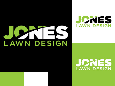
I have a blade (grass) cutting through the logo. It just cuts through the ‘one’ part of Jones emphasizing one choice / best choice. This helps also create a hill/landscape feel.
The o in O on the blade kinda resembles a sun setting/rising.
I kept it simple for ease of readability from a distance.
Jones in a heavy font to establish confidence and seriousness.
Bright green to bring energy and success feeling / results.
