P&P 2020
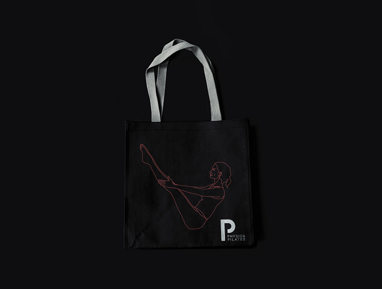
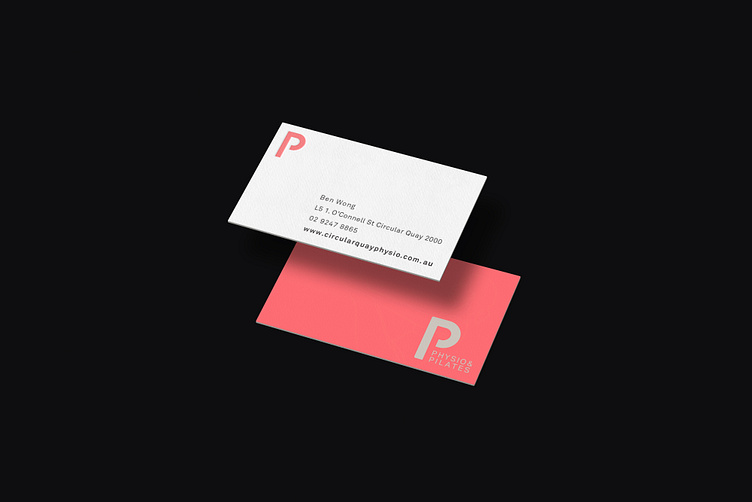
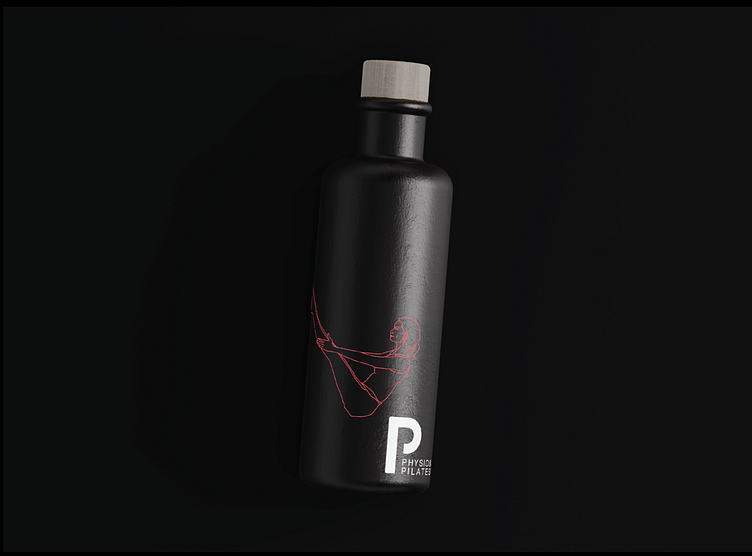
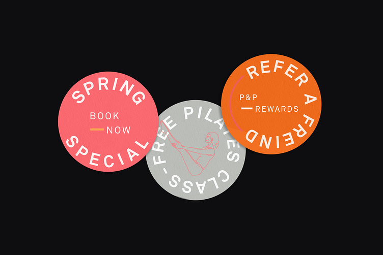
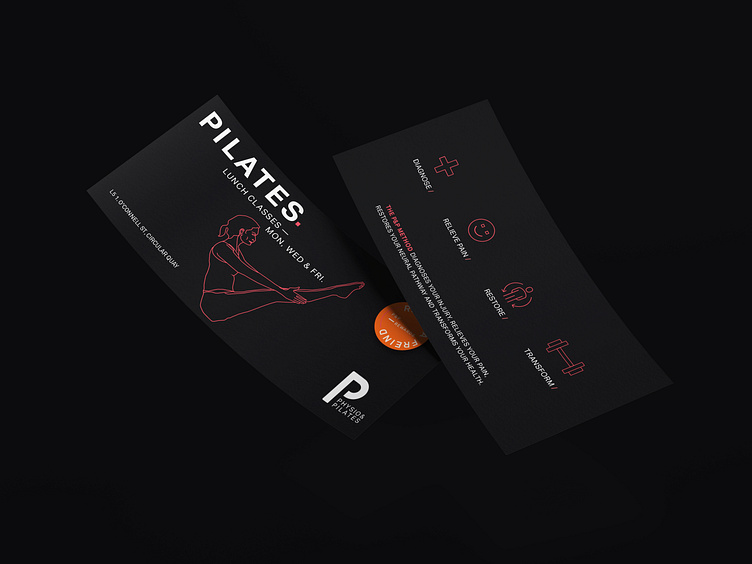
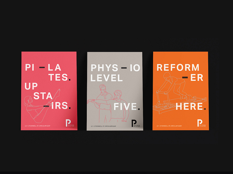
P&P approached me to assist them with developing their new logo and all associated material for their new location. The work was to identify with the high end demographic they were aiming to attract.
The “P within a P” logo mark was created and was to represent that pilates and physio could be found in the one studio. To stand out from the others a neutral grey and neon orange and red colour palette were used and intertwined with organic illustrated line drawings.
