The new one in a plate
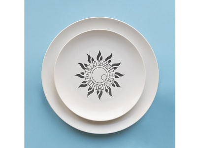
The idea behind this logo is that it looks like a sun with a horoscope inside it. Inside the horoscope the Earth and the Moon which are making the shape of the letter G together.
The idea behind this logo is that it looks like a sun with a horoscope inside it. Inside the horoscope the Earth and the Moon which are making the shape of the letter G together.
