A or B? Round 2
Presenting a client with a look & feel is only the start of a very rewarding process. Sometimes you create something that looks really good but isn't right for the client. And that's the important part: we are designing something for a client. Their spirit, energy and how they want to position themselves in the world must shine through in their brand materials.
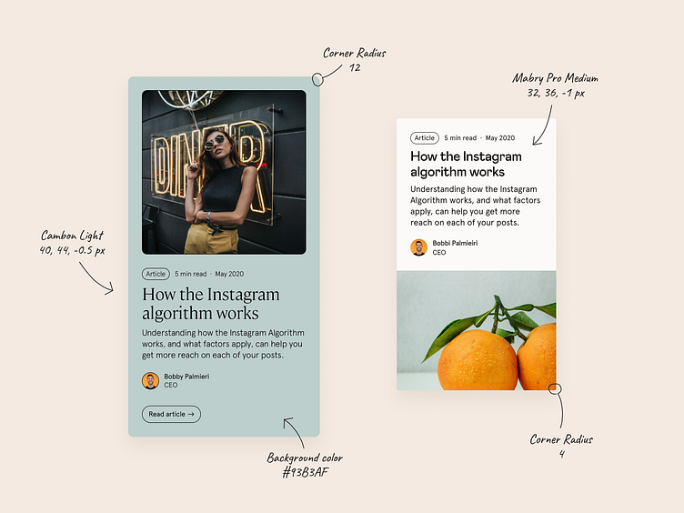
Here is a clear example where by changing color, typography and border radius can be enough to achieve something remarkably different.
So you can like one more than the other, but only one was right for Lilo (the client) 🔥 Our website @ Significa
More of our stuff too: Behance | Facebook | Twitter | Instagram