DailyUI #063 - Best of 2015
Zoom-in (click image) for better image quality.
Good evening Dribbblers 👋
This is my #063 #DailyUI design. 📽️🏆🎮
Design Hint 💻
No design hint today... 😔 Where are these disappearing off to? 😅
The Idea 💡
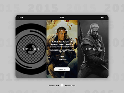
The idea for todays UI design is a web-based best of the years showcase landing page for each singles, movies and games creative medias. The landing page will feature a 'hover-able' dynamic 3 column layout, small snippets of information and a simplistic year navigational bar. The design will feature a mix of blurred, focused, grayscale and coloured imagery, along with a combination of sleek fonts and a minimalistic layout.
Final Thoughts 🧠
I like it! The unique 'focused' layout really makes this piece shine, it gives the user a more streamlined UX through the use of grayscale and blurred elements, to focus on one part of the UI at any given time.
Once the user loads the page up, they will first notice 3 grayscale slightly blurred columns, from left to right - best singles, best movies and best games - each background being the top/best rated in that selected creative media. Once the user hovers over a column the background will become focused and coloured with the enabling of the RGB spectrum; the other two non-hovered columns would remain blurred and grayscaled. Following the dynamic background change, a volley of centralised information would appear; the name of the top/best rated single/movie/game, along with their associated rankings via official IMDb and Metascore reviews etc. and a small summary of the single/movie/game. Underneath the summary lies the second and third top/best singles/movies/games with a 'view the list' button finishing of each column that simply links to a dedicated creative media categoric page with the full list of the best in their own categories.
Overall, todays design from concept to prototype was fun to come up with and was rather challenging to get it to feel 'right'. I had messed around with the grayscale/blurred dynamic aesthetic a lot to get the whole UI feeling up-to-age and to produce the bet possible UX I could. The end result; I think I pulled today's brief off relatively well and it's very close to what I had imagined it to be.
Share the love, press "L" or "F" if you ❤️ my work!
If you want to stay up to date with my work, head over to my profile and follow me. 🎨
As always, I welcome any feedback! 😄
- Elliot
