Gymshark logo concept
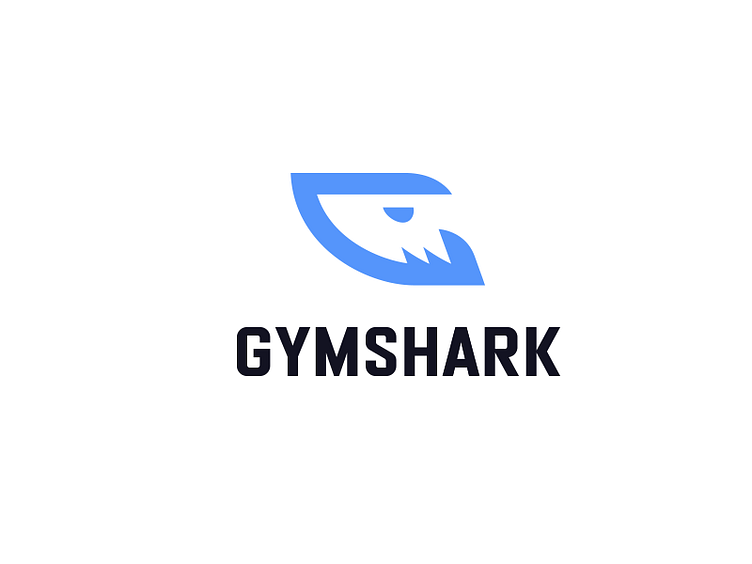
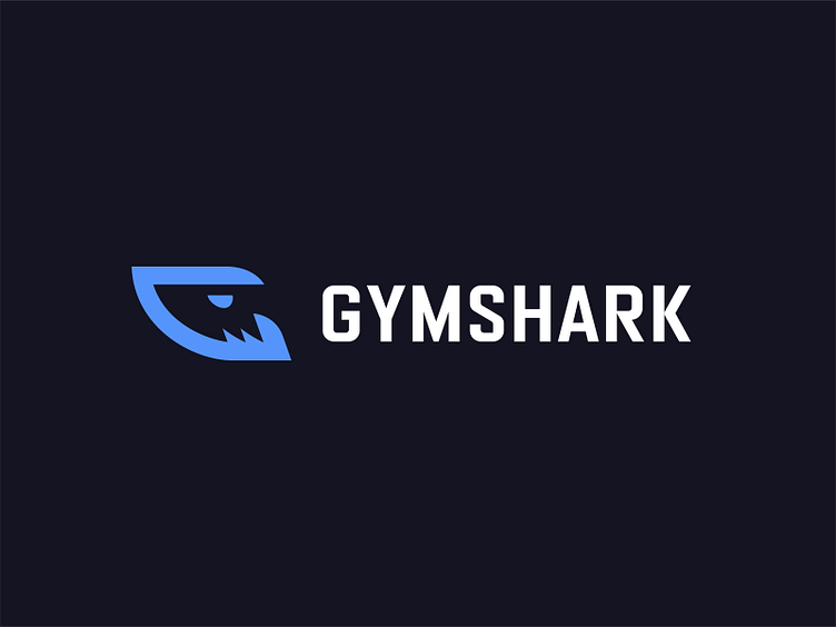
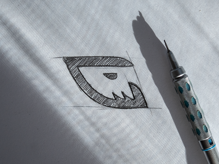
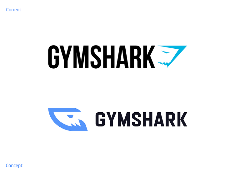
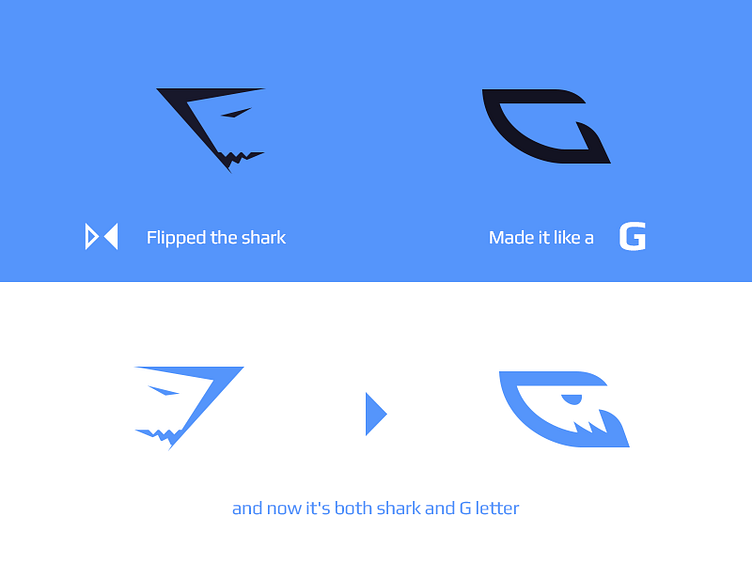
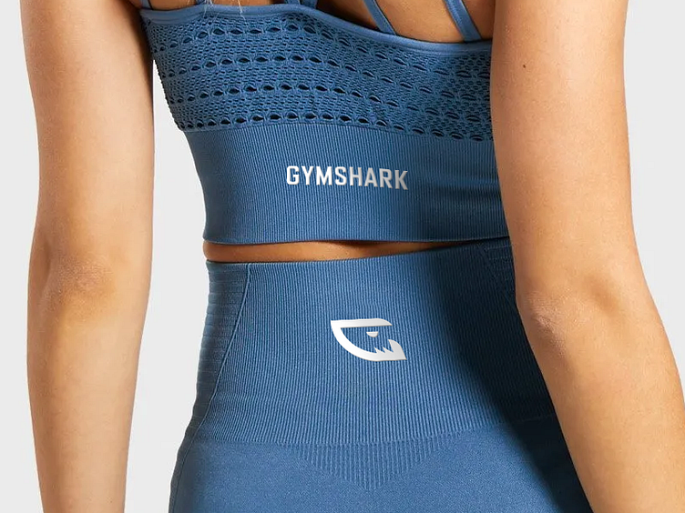
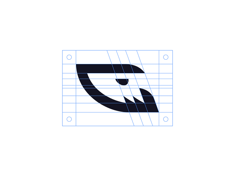
I always liked the negative space shark idea in the Gymshark logo but I'm not a 100% fan of the execution. I feel like it's slightly outdated but with a few simple changes, it could look awesome and still be recognizable by the audience.
What do you think and which one do you like more?
For a project reach out to me at daniel@kreatank.com
To see more of my work go to Kreatank.com l Behance l Instagram l Facebook l Twitter