Website Redesign (shot 3)
Another post about my recent website redesign.
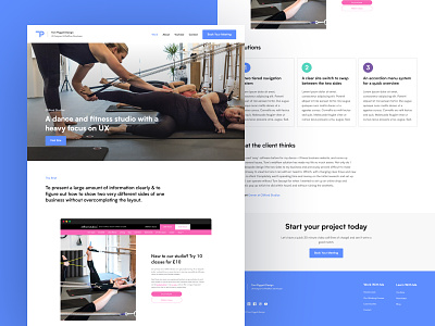
Here you can see the layout for the individual case studies. I don't want to overwhelm users so have kept the layout quite short, sticking to what I think are the most valuable pieces of information.
1. A nice image to get an idea of the world the project sits in, along with a call to action to visit the live website.
2. The brief. What was the problem that the client originally had? What did we need to solve together?
3. A screenshot of the homepage we came up with.
4. Highlighting the 3 main solutions we implemented.
5. A review from the client.
6. A call to action to book a meeting with me.
What do you think?
More by Tom Piggott View profile
Like
