Spotify Redesign
After about 2 years of using the Spotify Web App, the Desktop App, and the Android App, I have to say I am not impressed with the UI. The UI is inconsistent on all platforms and doesn't even meet modern design standards. Other music platforms blow Spotify out of the water with their user interfaces.
I decided that the UI needed a complete overhaul. I was initially going to redo their entire brand by creating a brand sheet but I believed that there wasn't much I could improve upon when referring to the logo and the color scheme.
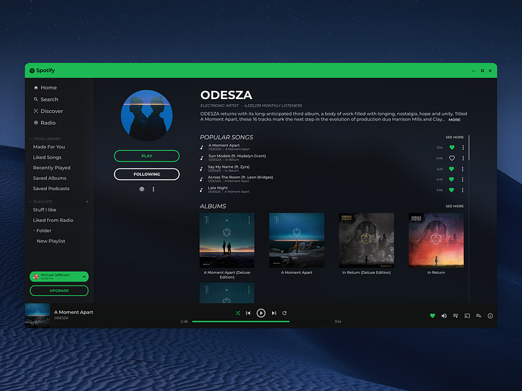
After 9 separate iterations, I present to you the final Spotify Redesign. This project took in total 14 hours to complete with the last iteration taking only about 2 of those hours.
I have been trying to get better at my design work. I believe my biggest flaw is my lack of variation. So this time, I decided to try and have a stained glass, transparent look. I used some principles of Material Design, Microsoft's Fluent Design, and the Fluid design standards to make this. I think this is one of my best works yet. Although I could possibly swap out the icons...
This shot is only of the artist page but all of the redone screens can be viewed here: https://imgur.com/a/QPwzTeF