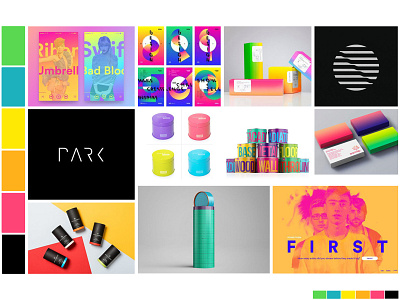
Identity Moodboard: A Brighter Brand
Recognizable • Cheeky • Fresh
Bold and bright is the direction for A Brighter Brand. Here we take the bold and make it recognizable, with a cheeky flavor and fresh design. The Base colors are intended to mix and match in all sorts of ways, giving endless variety to the brand and to the consumer. Our consumers run the spectrum, and so should we.
More by Kristofer Kish View profile
Like
