Kohcoon

WEBSITE LANDING PAGE DESIGN
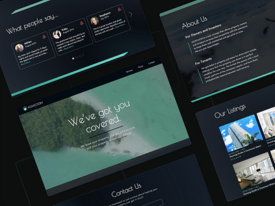
Kohcoon is a service that allows home-owners and investors to lease their Airbnb properties. From furnishing the space with local touches to accommodation arrangements, they take care of everything related to the property listed.
Goal
Given the rapid growth of their business, they were looking to create a landing page including some of their managed properties, as well as reviews to foment trust among prospective clients and investors.
Stylistic Choices
They were looking for a luxury feel-like, mainly black and with a clean UI. Since they didn't have any digital assets at the moment, I had the liberty to select typefaces, color schemes, and design their logo.
I chose Poiret One as their main font given its light, elegant, and sleek design. As a sans-serif font with a Retro and Art Deco style and with great curves, this selection provided the company a modern but atemporal look.
The secondary font I chose was Avenir Medium. Avenir always works great for body copy. It creates clean looking product websites and supports minimal content. Another layer to it is that Avenir means "Future" in french, and being both the CEO and COO of the company from France this added more meaning to it.
The main color used was a dark blue, hsl (208, 60%, 7%), that contrasting with the white typeface provided a crisp and minimalistic contrast. The secondary color, hsl (173, 100%, 74%), represented their friendliness and tech-savy structure.
Design
The main purpose of this landing page was to build rapport and redirect traffic to their Airbnb listings. In order to deliver a cohesive and integrated experience, I designed a website that seemed to be part of the well-established Airbnb ecosystem. This can be noticeable especially in the listings section -the one that aimed the most towards re-directing traffic.
Takeaways
The client was looking for a quick solution to scale their business, and he ended up happy with the results. Most of the time was spend creating and tweaking the logo, which took several rounds of reviews. Once we had that settled, the website came up pretty quickly and with little iterations. The challenge for me was to design a website with a mainly black interface, which can look terribly bad and with poor taste if not done properly. Now I feel much more comfortable with this color and look forward to my next challenge.
Thanks for reading! If you would like to collab make sure the get in touch. ;)