Home61
GIVING LIVE TO A NEW STRUCTURE
∙∙∙
Brief: In December of 2019 Home61, the top-ranked real estate brokerage in South Florida, announced that they were shifting their business model to 100% online. To illustrate their new vision, a new website was due.
Problem Home61 had been in the market for 5 years prior to the pivot. Along this time, the company made a pipeline of customers based on their previous system. The main challenge from the design standpoint was to effectively explain the new model.
∙∙∙
Goal Create a website that clearly explained the new structure of the company at a glance. By doing so, previous clients and new potential customers would be able to quickly assert if the new model satisfied their needs
∙∙∙
References A big part of this was to look at what other businesses with a similar approach were doing, in terms of their offering and their public presentation.
We made a list of the things that we could include to add value to our proposition compare to the market offering, as well as points that could be useful to include, and then took off from there.
∙∙∙
Definition Process As part of the definition phase, we conducted several sessions to coordinate the essential elements that the new structure should include. We started to form the skeleton from the absolute must do the nice to have. We created several user maps and journeys that included the new back office requirements.
∙∙∙
Wireframes Like in any other project, once we had set the actionable items and main functionalities of the website, I created the low-fi prototypes. This allowed the team to see the ideas down on paper and make sure that everyone was on the same page before jumping to hi-fi wireframes.
∙∙∙
With everyone on board with the user journey, it was time to jump to the hi-fi prototypes. I created several screens with a design closer to the aesthetic we were going for. After one more meeting and some changes in the navigation, the team was happy with the structure and presentation and I was ready to move to the next stage: the final design.
∙∙∙
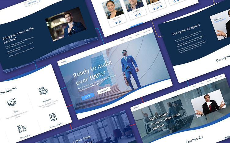
Final Design The final design involved a meeting to go over color schemes, typography, and other visual elements such as stock photos. I had a list of suitable options according to the style we were aiming to have, and we picked from there the definitive ones. As far as color palette goes we decided on blue to convey trust and set Home61 as the established business they are. This was a change in their primary color, which used to be teal. The images were luxury-focused and on the elegant side. We chose to showcase people in suits and having meetings, targeting agents with this vision of themselves. For headers we selected Athelas typeface, giving the website a fresh and modern look. The body text was Avenir Next, which is considered one of the fonts the cleanest and simplest fonts with a human touch.
∙∙∙
Takeaways The main takeaway from this project was the dynamic of working on a product that needed to be done within a tight deadline. We had less than a month to launch it, so we needed to make sure that the communication system was effective and efficient. Our meetings were sharp and planned ahead and our agenda was clear about the next steps to follow until the next revision.
∙∙∙
Thanks for reading! If you would like to collab make sure the get in touch. ;)
