For Crew Only

Problem
With so much competition in the market, For Crew Only was getting behind in their look and feel. This was affecting their lead acquisition, as 97% of the users that visited the website were leaving within the first 10 secs.
Goal
1. Redesign the website in a way that represents the company's culture.
2. Make the user experience more aesthetically pleasing.
3. Inspire confidence and certainty in the brand.
∙∙∙
Design Process
I followed IDEO's Human-Centered Design and Lean UX Design Thinking for the design process.
∙∙∙
Target User and Market
To have a basic understanding of the potential user of the crew service, I started by creating a user persona. This allowed me to orient the design towards the most adequate market.
Since the company had preconceived which sections they wanted to have in their website, this study was about empathizing with potential clients. The website needed to look solid, while at the same time quickly conveying that the service offered was the solution to their needs.
Scope
User: People aging 20–40 years old who would like to have more options to shop.
Market: Cruise crew members around the world.
∙∙∙
Design Principles
1. Seamless integration: The new layout needed to be easily assimilated by the current users of the service.
2. Simple: It should be clear to potential clients how does the service works and what is the offering.
3. Polite: Although the main purpose of the redesign was to gain more leads, the navigation through the website should be as non-invasive as possible -just one opt-in pop-up during the scroll time.
∙∙∙
Research
In order to build a website that represented the state of the art of the market, I researched competitors in the industry. I took note of some key elements that all of them had in common, like a clear explanation of how the system worked, as well as the ports that they delivered to.
Once I gathered this information, I was ready to start prototyping.
∙∙∙
Wireframes
To explain the new structure of the sections to the client, I sketched 3 lo-fi prototypes. We had a meeting where I presented the proposals and we created a hybrid of two of the options.
Having the layout and the content already squared the way the client envisioned it, I moved forward with the a hi-fi prototype. I shared the project with the client via Invision to make sure that everything was the way we discussed it.
∙∙∙
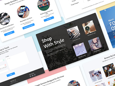
Final Product
The final product kept all of the sections of the old website (except for one that was repetitive), but it has a new look and feel. I have placed both designs side by side at the end of this section so you can appreciate the changes.
One of the things that I proposed to change during our prototyping discussion was the layout of the categories.
In the previous design the categories were cramped together, with the last four placed over a black background. When I inquired about the reason behind this decision, the client clarified that the company needed to separate luxury items from regular ones, according to a contract with the providers.
My proposal was to create an entire new section for this products, along with a brief description of the section, to really evoke that luxury feeling that they were looking for.
∙∙∙
Takeaways
Creating a website that showcased the new branding of the company, while keeping their core elements, was the biggest challenge. Through meetings with the client and research about the competition, I was able to deliver a product that addressed their needs and they were proud to announce.
The website is currently under development, but once it is launch I will update this article with the new metrics after 1 month of performance.