Frame Coffee Co Logo
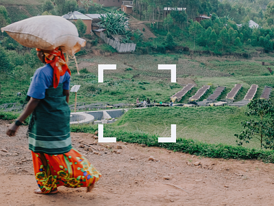


The Frame Coffee Co logo definitely went through some awkward phases before we landed on this guy (will hopefully get to share some of those other iterations over time). Our brand strategy team came up with the phrase "frame coffee differently", and that idea is what inspired the final direction for the brand. Affectionately named the "anti-logo" by our marketing crew ( 😬), the concept behind the icon is to capture and emphasize process and product over "brand aesthetic".