Student Garage Sale
I have created a garage sale app for students! This was inspired by my recent experience of trying to sell a bunch of things from my varsity days - I kept thinking, I wish there was a way to sell all of my student stuff in one go instead of having to sell bits and pieces on marketplace etc.
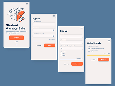
This is the design I did for the landing page and sign up, I will be posting more on the actual app function tomorrow. Once again I used #Figma to #wireframe and Gravit Designer to design my little box illustration (I would love to learn more about creating quirky minimalist illustrations!)
These were my deliberate #UX design choices:
• Although flat buttons are trendy, I’ve chosen to give my primary button a drop shadow for perceived affordance.
• I used colour dominance to indicate information hierarchy, for example, the headings are darker than the paragraph text.
• During the sign up process I clearly label each input field, many designer’s prepopulate fields with labels which can result in frustration when a user clicks the field and forgets what they were supposed to type there.
• I created a progress bar to help the user create an expectation of how long the sign up process would take. I also split the signup into 3 steps so as not to overwhelm the user with one massive signup form from the outset.
• For negative actions (such as cancel) I made the button less prominent in the design.
