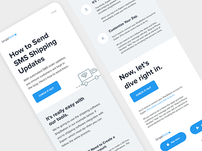
Email and ad design prototype for Simple Texting
Hey there!
What you see here is a prototype of a blog turned into a newsletter email. Namely the "How to send SMS shipping updates".
Offering your subscribers a digestible way to consume information is a great way to build trust and boost their user experience.
The design itself is fully following the branding of SimpleTexting, as well as following the type scale present on its website.
But looks aren’t everything. Does this email follow key accessibility best practices? Let's find out!
✓ The layout is aligned to a 4pt baseline grid to ensure vertical rhythm.
✓ The email has a "meta content-type" and defined character set.
✓ Email headings should be well structured. This will help screen readers easily navigate content.
✓ Larger paragraphs of text should be left-justified to improve readability for some readers.
✓ And for the vision impaired table roles should be clearly defined. This helps screen readers determine how to interpret the table.
I've also included a potential design for a Facebook ad that features a simple style that could be explored and implemented into the brand if you see fit.


