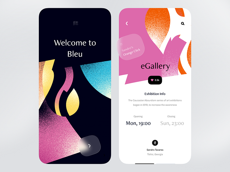
Arts Exhibition App — Splash Screen & Event Page
Hey, Dribbble what's up?
Been watching the popular shots for the last few months. Saw everything, starting from 3D guys, muted colors, blurred smooth backgrounds to every iteration of the Frosted Glass™️ effect.
Some of them were very subtle, some heftier, but most of the shots were like utter garbage.
The reason you ask? Because at the moment there is a very small number of shots produced that are excellent in most of the ways.
The community somehow got trapped into the current, where anyone who makes the trendy shot with a zero knowledge of basic principles, will get his own, well-deserved 15 minutes of fame.
Okay, you may like one aspect of the shot like the color scheme (Dribbble was always all about colors) and perfectly get along with it, but you must not fully disregard other aspects of Interface design such as typography, usability, whitespace, and the overall information hierarchy.
Unfortunately, the shots that I did see recurrently, over and over, were degrading copies of each other, diminishing its inspirational value in each reproduction.
That's really sad.
I perceive this place as the venue where you demonstrate your skills. You may have a good sense of softening the edges of the dashboard card, but in real life, after all the work you've done, your design becomes available at the palms of the regular minds out there. So you won't get away with only a softened edge.
Broad your skillset - Broader the chances to make a triple-double. So let's be excellent in every way.
Peace and love.
