Pantera wordmark
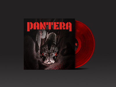
Redesigned my favorite band's logo wordmark and slapped it on an album cover. The original logo always bugged me - it had weird weights and the two large letters "P" & "A" made it look really unbalanced.
Wanted to keep the tough military vibe of the original, that's why I went with the stencil style typography.
R.I.P. Dime & Vinnie 🤘