Website Redesign
Tom Piggott Attachments 09:41 (39 minutes ago) to me
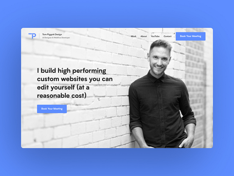
Here's the hero section for my new website. I've made some time to work on a complete overhaul of my site. Previously my website was purely a portfolio showing my work and that was essentially it. I want to build a site that talks to my potential clients, so I've put myself in their shoes and tried to create what I think they'll want to see.
This here is the first thing anyone will see when they land on my site. Without wasting any time they instantly know exactly what I'm offering - high performing, custom websites that they can edit themselves. And for a reasonable cost? Great. Right below that they have a button to book their meeting. This launches a #Calendly calendar pop up that allows them to book a free 30 minute meeting with me. The goal here is to be clear - I haven't used a vague call to action like "Get started", I've been about exactly what that button does. This is good UX.
I've looked at a lot of designer's and agencies' websites and most of them show an illustration or a piece of work they've created at the top. I don't need to do that here because 1) most of my clients are referrals so they know why they've come to my site and 2) I've just said in my header exactly what I do. So we have a picture of me which helps to create a connection before they've even met me. I look friendly and approachable (I hope you agree!).
So to wrap up, within a couple of seconds, a new user on my website knows exactly what I'm offering, how to get started and has started to build a connection with me, albeit a small one.
