Vistara App UX Restructure
Hey Guys,
This is my take on Vistara App. Fullcase study on
Medium
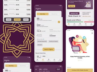
Right now the app has no onboarding experience laid out. Also it follows two screen approach for booking, flights, checkin etc, the options which can be placed neatly in the footer but vistara neglected it possibly because of no proper competitor analysis. Users have short memory span so he should be present with these choices in single screen which can be the footer and also it decreases one extra click also! And one of the most critical flaw in its book flight ui is the Search button which is placed right in the bottom. A customer has to go all the way to the bottom whenever he wants to check different routes or other changes to the details. Also the user is bombarded with options in a single screen that is in book flights screen which is clear ignorance of Hicks law. User should be presented with information in digestive bits so that his choices can be easy. Have to improve these! The numbering shown in header area for flight booking to represent number of steps is giving a hurried feel while booking, taking away calmness. One needs to hurry when booking for sure but not so hurry with showing steps that he lose focus. The numbers are taking away lot of attention and wasting the header real estate. Also on homescreen i have made responsive enabling and progressive disclosure design patterns which leads to next screen for booking flights with other input details to be added before booking a flight.
So far I improved he dashboard screen, onboarding and Search Flights Screen which are of prime importance. I will be uploading a detailed case study soon :)
----------------------------------------------------------------
Share some love by pressing 'L' if you like this shot :)