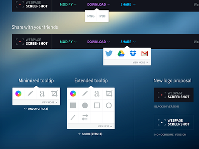
Chrome plugin redesign proposal
As I was looking for a full-page screenshot Chrome plugin, I've found "Webpage screenshot". It's a little plugin for chrome which allow you too take screenshot of your screen, modify and eventually share them.
Here is an example of the plugin in action. I tried to take a screenshot of the Lift website homepage : Ahem °_O.
What could be improved
Too much density of information, lack of organisation which results a painful user experience. That's pretty bad because the only function I was looking for (take a full page screenshot and save it) seems to work pretty well. This little plugin looks a bit "cheap" because I guess the efforts were put into everything but the design of the product itself.
As a personnal exercice I tried to redesign "Webpage screenshot" in order to create a better and simpler user experience.
Information Architecture
- In order to simplify, I tried to focus on 3 three main features : Modify, Download, Share. (I wanted to keep _as much as I could_ the features of the real product in order not to destroy what have already been made)
- Delete all the noizy content which is not related to the core features
- Display the most used options to the user and hide the rest in order to make it clearer
User Experience
- A system of tooltips allows the user to easily find what he want to and switch between the three categories "Modify, Download, share".
As said before, only the most commonly used options are given to the user, the other part could be displayed with a simple show/hide link at the bottom of each tooltip.
- I didn't make it but the use of soft transitions / animations could also improve user experience.
Identity
- Logo redesign (a mix between a window frame and a camera focus).
- Simple and contasted color scheme in order to create a strong identity and help the user to clearly identify the 3 core features.
That's it. It was a good personal exercice.
Files attached
If you're intereested you could take a look to my proposal of redesigned User Interface elements.
I also attached an in-situ version of the redesigned plugin. On the same Lift website homepage.
---
Note : If the Webpage Screenshot team is interested I could of course give my sources.


