Financial platform design
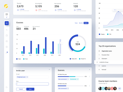
Today we have here a part of UI-Kit, which we made for one of the projects: more than 100 components, more than 50 pages of the project and an excellent review of the work done!
We prepared this excellent set of graphic elements for one of our design projects for an online financial platform. A color scheme with an accent in clean greens and blues, complemented by strict, thin lines, gives the elements a crisp and formal style, while maintaining a fair amount of airiness and freshness.
Do not forget to structure and plan your project, because a well-done work becomes more enjoyable when everything is "sort through" :)
---
Press "L" if you like it :)
Want to see more projects? Visit our Team and remember Andersen ;)
More by Andersen Design View profile
Like
