Text Messaging Mobile App Redesign
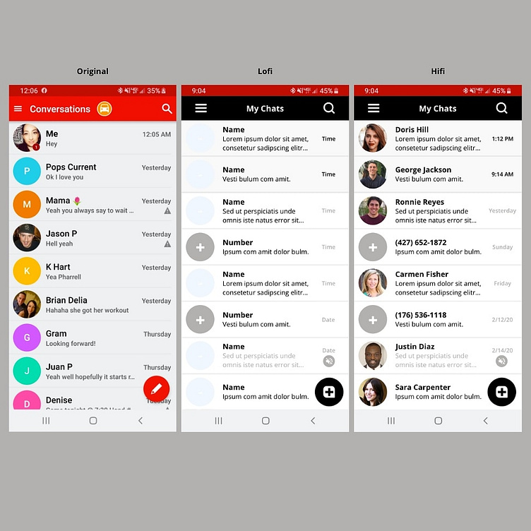
I decided to give the message body previews more space by adding another text line and divided up the total space with fewer message rows in general for more visual clarity.
I changed the new message icon to something easier recognized as a new message and I incorporated the option to add new contacts by adding the plus signs in the photo sphere.
I highlighted unread messages by shading unread text bodies and I reinforced the muted conversation with lighter text and a clear icon. I chose a basic color palette and a well known, easy to read font type to enhance readability. 📱📲
Instagram.com/Cassclarity
