Twine logo presentation
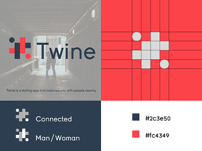
Twine is a dating app that matches you with people nearby. In this logo I was working with the ‘’Grid system’’. So as you can see the icon is divided in perfect square’s, 4 by 4 square’s.
There is a ‘’man’’ and a ‘’woman’’ that looks like its ‘’connected’’ to each other.
I choice the colors blue and red. The blue stand for: Man and trust. The red color stand for: Woman and Sexual.
Happy to hear your throughts!
More by Burak Altunkaynak View profile
Like
