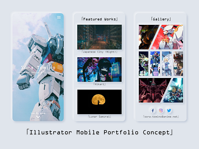
Illustrator Mobile Portfolio (Neumorphism Concept)
Hey Dribbblers!
Update: My case study for this is up now on Medium! Check it out here (https://medium.com/@aeternumrd/illustrator-portfolio-site-a-case-study-8e3968bb0287) and I hope it'll inspire your next design!
Taking a brief break from learning how to code, I wanted to revisit an experimental concept idea that I had a while back. Using the tutorial from Kanhaiya Sharma (https://uxplanet.org/neumorphism-in-user-interface-tutorial-c353698ac5c0), I wanted to showcase a hypothetical artist's work using neumorphic techniques.
For this mobile page, I used neumorphism for both an aesthetic and functional effect: each art is elevated and highlighted while also signaling users that each neumorphic element can be interacted with.
What do you guys think of it? Let me know in the comments below, and if you liked it, be sure to hit that "L"!
Want to collaborate or hire me? Contact me at theo.oing@gmail.com!
