DailyUI #061 - Redeem Coupon
Zoom-in (click image) for better image quality.
Good afternoon Dribbblers 👋
This is my #061 #DailyUI design. 🎫💰👚
Design Hint 💻
Imagine that it's time for someone to redeem a coupon. It could be via an in person self-checkout screen or on a website. Think about the requirements of a coupon such as the discount percentage, the subtotal, total, and other unique features.
The Idea 💡
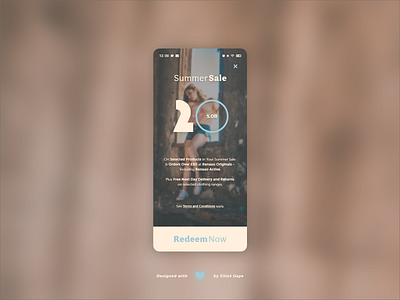
The idea for todays UI design is a private sale coupon screen for a theoretical high-end online apparel store, called Renauo. The screen will feature notable typography, sales information and a bold redeemable button. The design will feature a light and summery pastel colour palette, a 'model' background and some sweet and stylish typography.
Final Thoughts 🧠
Utilising a straightforward, top to bottom informational layout, the typography combination and colour palette really sets this design apart; it is indeed unique.
Although I had wireframed the design first off and iterated it a few times before coming to my final decision, the design really relied on the blurred background. I wanted a photo that features the 'summery' aesthetic (for it being a summer sale) with a prominent female model (for the apparel aspect), but not to dramatic, preferably a more 'tame' photographic background. I found one, and it really did do the entire screen justice, it was the perfect combination of colour and tame nature.
The typography is a huge part of the screens design, too. I planned the design to be based around the tall and chunky percentage number in the centre of the screen. I wanted the numbers to be tall to give off an overarching feel for both it being the one element I wanted to grab the user's attention, and also the fact that it's a big sales percentage; I think I pulled it off pretty well. The sales information below the numbers are presented in a more unified and legible font, creating a better UX. The paragraph has the vital sales info, whereas the more legal documentation is hidden within the ToS link displayed underneath. A large and bold 'redeem now' button finishes off the screen, allowing the user to unlock their private summer sale.
Overall, I really like the look and feel of todays design! Just at a glance it feels summery, bright and well, high-end! I love what I have designed this afternoon. Props to the photographer, too (credits below).
Unsplash photo credits 📷
@danielapodaca96
Share the love, press "L" or "F" if you ❤️ my work!
If you want to stay up to date with my work, head over to my profile and follow me. 🎨
As always, I welcome any feedback! 😄
- Elliot
