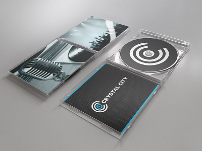
Media Company Identity
Nashville based media company "Crystal City" contacted me wanting a new logo design.
Creative process: My challenge with this logo was to come up with a design that encompassed all of the company's services into a simple graphic. After much brainstorming, I concluded that the "push play" symbol (triangle within a circle) fit this need. It's a symbol that's universally recognized with both music and video (two services provided by the company.
Enclosing the "push play" symbol within the Crystal City "CC" initials reflects the idea of media being at the center of the company. It also creates for a compact, versatile and aesthetically pleasing design. For the text I chose a font that fit the feel and thickness of the logo elements.
More by Derek Kimball View profile
Like


