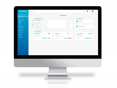
Web app design for Requyre
I've made this web app design for a new, young company. The blue menu gradient corresponds with the company logo. The dashboard was kept as clean as possible, so the user has a good overview. Some colors were used to quickly show process statuses.
More by Marie-José Arts View profile
Like
