CubeSmart Rebrand
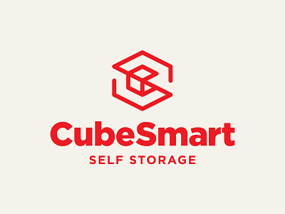
Rebranding CubeSmart, a company specializing in self-storage facilities. Swipe through to see my concept compared to the current logo CubeSmart uses.
Overall, I really wanted to create a mark that was more memorable compared to the mark they currently use. My concept still incorporates the cube shape, but also incorporates the letter C and S, forming the overall cube shape. I also wanted to clean up the type a bit and get rid of the small caps used in the word CubeSmart so that it didn’t look so blocky.
I would love to hear what you think!
___
More by Dylan Menke View profile
Like


