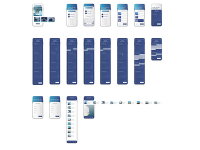
Calendar Date-picker for Executive Retreat App ( e x u r o )
The final product is - unsurprisingly - a date-picker and solely a date picker. Its brewed in such an intense manner that it was stripped of the features and elements that were potentially irrelevant to its purpose (not to the utter exclusion of said features - but toward their selective placement within a following or previous stage within the booking process). The date picker - as an overlay - is an opportunity to exercise showcasing the identity and capabilities of the hotel app brand.
This particular case is intended as a brand for executive retreats & accommodations (e x u r o), concept which was highlighted through:
- the abusive and constant decluttering of all potential elements;
- the strong contrasting overlay of the calendar onto other potential sections, matching that of the brand’s visual identity;
- the enforcement onto all elements of a common chromatic balance formed by a limited palette with soft and dynamic contrasting;
- the serene selection of the chromatic balance within the date-picker calendar;
- the typography of geometric minimalism correspondent to architectural trends - illustrated through a relevant type face (Century Gothic) which must also reflect a premium experience of luxury stays (as per the invoked brand identity);
- a constantly elegant composition of simplicity through the structure and proportion so as to illustrate the current architectural luxury trends of industrial minimalism.
