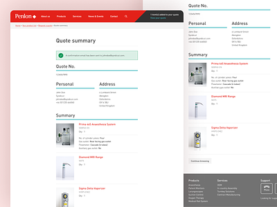
Penlon Quote Summary Page
The quote summary page to give the user an overview of what they’ve submitted for a quote.
A later addition that we added to the site design was this secondary teal colour, anything that uses the teal colour is to signify that it’s to do with the checkout – a small detail but one that we needed to add as their was no differentiation between actions.
Created at Syndicut.
Need help with your project?
Get in touch 📮 hello@robsimpson.digital
More by Rob Simpson View profile
Like
