Sure Thing - tech startup logo & branding


#throwbackthursday
Hi everybody!
📖Story Time: Another one from the drawer (Check out the previous one here). If I remember correctly, this design is over 3 years old. Created for a tech startup in London called Sure Thing. They focused on creating custom dashboards and big data visualizations and they were great at it; hence they were a “sure thing”.
They were a great client and gave me a lot of creative freedom. We started with a couple of word associations: Alchemical, Mathematical, Magical, Symbolic, Unique, Gravitas, Complex. These concepts fit with the brand message and the way they wanted to communicate with their clients and the world.
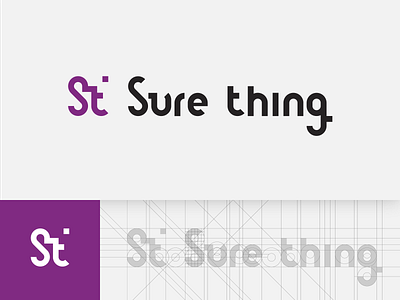
The brand emblem, which was supposed to conjure images of long forgotten alchemical symbols, is actually a monogram of the first letters - S and T.
Typography is fully created by me - I wanted to design something special, based on a grid, using mathematical ratios and modules. I doubt any font would fill this need, so I created a system of my own.
From the ST mark, I’ve also created a pattern that would later be used on T-shirts, pins and other gadgets.
Even though I hate this design now (as I think all designers do with their creations after time) back then I was pretty happy with it. So you can imagine my heart breaking 💔, when I heard that less than 5 months after introducing this branding system, that the client was bought by a large corporation. Everything I’ve created was scrapped and changed for the new owner’s brand.
Ah, c'est la vie ¯\_(ツ)_/¯