Logo
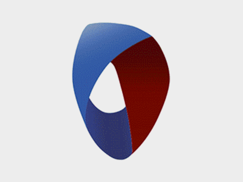
The logo was developed for a geriatric care management company. The band represents the inner part of a loop. The ends are not open like a loop. Instead they unite. This symbolized cohesion, support and care and togetherness. The variable color combinations stand for different departments in the company.
