Nómada - Branding
// BRAND
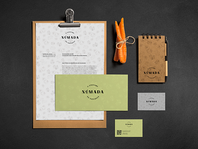
Nómada is a Portuguese company operating in the food sector. Its name takes us to the beginnings of humanity and to the human need of exploration to know nature and its products, to survive. So as not to compromise the quality of its products, Nómada offers Portuguese flavours and seasonal products, cultivated and harvested by our artisans.
// CONCEPT
The logo is composed not only of the brand name but also the slogan "O engenho da Natureza". The font used, Regatta Bold, serifed and strong, intends to mark its presence transmitting traditional values, strongly rooted in the brand and the choice
of its craftsmen and the manufacturing of its products.
The changes made to the letter "A", resembling a bridge or bond translates the link Nómada makes between the past and the present: the traditional values and the connection our ancestors had with nature, accessible and accommodated to the Portuguese of today, who now have distinct lives.
The letter "O" now transformed into a fruit, serves as the connection to the food sector where the brand operates. It also removes the weight of a premium brand showing the simplicity behind wanting only the necessary.
