NISSAN - Redesign
NISSAN LOGO REDESIGN 🚘
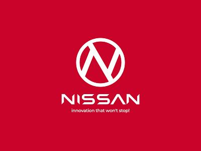
This logo/brand redesign of Nissan is done in order to create a modern and well-spoken brand for Nissan using a lettermark containing the initial letter 'N' and car steering handle. So, a combination of this clearly shows the sector in which the company is operating. I used this lettermark in combination with a well-suited typeface for the company name like many other competitors are using this type of logo for their brand. Also, I have changed the tagline/slogan to 'Innovation that won't stop!' and it can be clearly seen through the logo.
💬 Did you like the new version or the old one? Tell me in comments below 👇👇
Press love ❤️ if you enjoyed it.
--
𝐈𝐧𝐭𝐞𝐫𝐞𝐬𝐭𝐞𝐝 𝐢𝐧 𝐰𝐨𝐫𝐤𝐢𝐧𝐠 𝐰𝐢𝐭𝐡 𝐦𝐞?
Contact me at logokick.design@gmail.com
Let's connect:
Behance • Instagram • Facebook • Twitter • LinkedIn

