Filter Sidebar
📚✨ Story time ✨📚
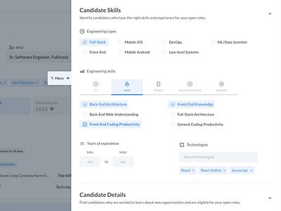
This filter sidebar UI design was my biggest (and most favorite) project to work on last quarter!
Triplebyte's company-facing product is a tool that helps hiring managers, recruiters, and sourcers search and reach out to potential future employees who match their hiring needs.
The opportunity for this design challenge lies in our filtering feature. We're constantly adding and experimenting with all sorts of filtering options, so we needed a way to make the UI organized and easy to use, even if we have a whole lot of filters.
With this design, filters are grouped in collapsible category drawers that would make it easy to look for specific settings.
The most important optimization is the fact that this new filter design is tucked away from the screen and will slide in as you need it by clicking on the "Filters" tab. By not having the filter settings directly on the search results page, we are saving a whole lot of screen space so our users can focus on what they're using Triplebyte for: to search for candidates.

