Tweago - Brand Identity


This is Tweago! One of my proudest projects so far. Unfortunately, I can't tell you that much about Tweago because it's still under development, but I can tell you everything about my process.
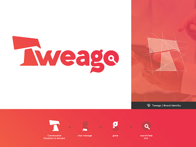
This project was a tough one. I started off by trying to combine every important/dominand aspect of Tweago into a single logo-icon. But because of Tweago's many and unique services, this was something I struggled with for quite some time.
After a few days, I thought to myself that it would be a good idea to dive back into my original orientation and find a new, better way to approach the problem of combining all the unique services into a logomark.
Imidietly after I did that, I got the idea to make a logomark out of the name itself. And after some long nights, there it was, the official Tweago logo. The logo (except for the 'T') is built out of the typeface 'Aquawax'. Don't get me wrong tho. It's nothing like the original typeface itself, I made a lot of changes and tweaks to make it perfectly match the wanted expression for Tweago. You can check out wich services I combined in the logo on the first slide.