DailyUI #058 - Shopping Cart
Zoom-in (click image) for better image quality.
Good' afternoon Dribbblers 👋
This is my #058 #DailyUI design. 🍩🛒🍩
Design Hint 💻
No design hint today... 😔 Where are these disappearing off to? 😅
The Idea 💡
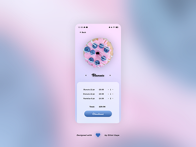
The idea for todays UI design is a shopping cart as part of my theoretical mobile food marketplace app for Android and iOS I came up with on my #036 DailyUI. The screen will feature a prominent carousel single image gallery showing off each item in the current shopping cart, while also featuring a list of items along with a 'checkout' button. The design will be inspired by my #036 DailyUI, with a vibrant gradient colour palette dominating the screen, along with a sweet and stylish combination of font faces.
Final Thoughts 🧠
It's fantastically vibrant, minimal and simply intuitive. Just like what inspired todays design, the gradient background really makes this UI, it makes all the other elements pop on the screen, especially the prominent donut image, which is what I wanted; a prominent bold image of the product.
Once the user navigates to the shopping cart itself they would first see the prominent image of the product hovering near the top half of the screen, they would then notice the bold title of the product, where they could also scroll (or tap the left/right arrows) through in a carousel like way to view the other items in the cart. With the bottom half of the screen being the place where the user can view all the price information and add/subtract an item from the cart. A simple button finishes of the screen to progress to the final checkout screen.
Overall, it's been a chillful and fun afternoon of designing my donut shopping cart UI. I really love the aesthetic feeling of todays design!
Unsplash photo credits 📷
@the_modern_life_mrs
Share the love, press "L" or "F" if you ❤️ my work!
Head over to my profile, follow me to stay updated on my work. 🎨
As always, I welcome any feedback! 😄
- Elliot
