Doo 3
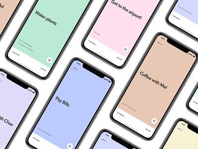
Doo 3 is the next iteration of my to-do app obsession. I started Doo as a revolt against typical productivity software. I reject the idea that you need 1,000 features and instead want to focus on building something with an opinion. I want people to discover how to build better habits without feeling bogged down by their software.
This is a brand new design with a heavy emphasis on minimalism. Doo is the to-do app that wants you to focus on one thing at a time. The design has been stripped down as much as possible while still being inviting and warm. Each task takes on one of two dozen colors.
I've also completely re-thought task entry. Type a task title and options appear over the keyboard. As you select things like date and time, your choices build as a sentence. You can tap any part of the text to edit. This approach works together with a custom keyboard set to make creating reminders much faster. So much so that I had to slow down my App Previews so people can process what's happening.
I hope you'll take Doo for a spin and share your thoughts. It's been a heck of a year to be locked in my apartment building an app, but I'm so happy and grateful to have it out in the world. More to come!

