Mamoré
The name Mamoré refers to the culture, geography, fauna and flora of Brazil. The name comes from the Amazon basin, is easy to pronounce and is strong like the Amazon rivers. Mamoré is a company committed to quality and tradition. It operates in local commerce in the food and hotel business.
Its mission is to provide food products and hotel services in an organized, agile and with the best cost-benefit ratio. His vision is to be considered the company that has the best cost-benefit ratio in the region.
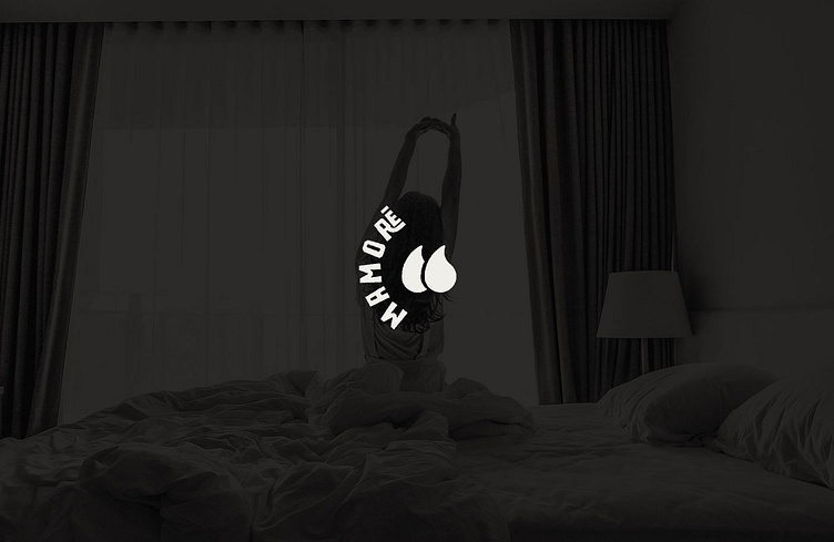
The goal is to convey confidence, quality and fair price. This is Mamoré, it is this thing of starting small as a spring and aiming to be thriving like an Amazon river. The main concept for creating the logo was the stylization of two drops of water from the river that together form the quotes.
The quotation marks used here were intended to convey communication, conversation and content. Mamoré values quality and tradition with its customers.
To see more work click here 👇🏻👇🏻 http://pribellafronte.com.br/
