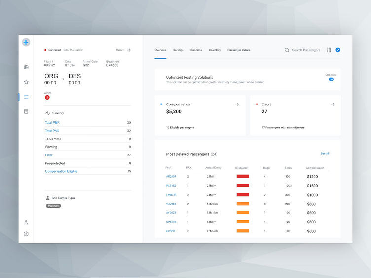
Flight Distruptions Detailed View
Here's the another screen from a concept I worked on for an enterprise application.
This is the second screen in the user workflow that shows a detailed overview of a row selected from the previous screen.
I used colour sparingly to let the user clearly see the options available to them and to help them understand the next steps in their workflow.
More by Mike Small View profile
Like
