Simplr Icons Improved!
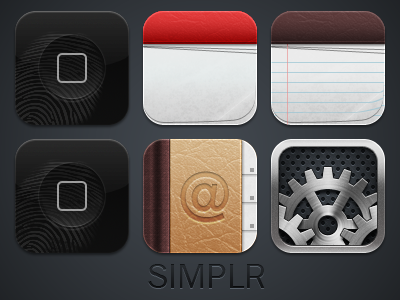
I went back and improved a lot of the icons, some of them had issues with colors bleeding through to the next layer (specifically on Calendar, Notes, and Contacts). I brightened the fingerprint on the WinterBoard once again, I also added a grungier fingerprint because I realized that that looks a bit more realistic. I put a new "cheese grater" pattern on the settings icon because I like the subtle feel of the colors and upped the contrast on the gradient for the middle cog of the settings icon, I don't know if I like it because I liked the previous softer version... I'd appreciate any feedback you have, compliments, criticism, anything!
