Lifthope charity brand identity
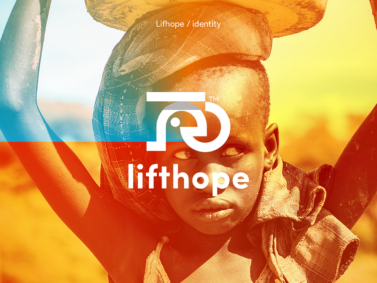
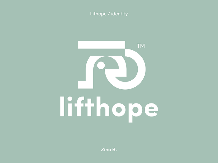
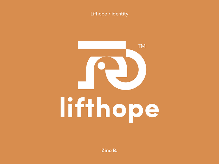
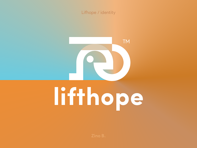
Lifthope is a charity company, they want to help struggling people in the third world not only by food and donations but also by lifting their spirits, thus lifting their hopes and dreams. I am a big believer in the power of branding (along with storytelling) on spreading a message better to reach a much wider audience. Now coming to the logo, The concept was inspired by the idea of a person carrying hope on his head like they carry clay pots in those parts of the world. hope is symbolized by a straight line in the logo because a straight line can go to infinitely when stretched left or right, just like hope, it’s infinite 🙂
Hit "L" if you like this
Need branding help to spread your message? Let’s work together zinobelkaddas@gmail.com
