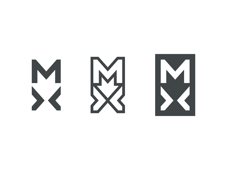
Logitech MX Identity Concept
Even though this playoff isn't about redesigning the identity, I noticed a lot of logos posted and I wanted to try my hand at that, too.
To me, what shines about the MX series is how easy it makes the flow between processes, applications, and even systems — and I wanted to capture that in a design. Similarly, Logitech thrives on simplicity, so I wanted to create a mark that feels professional, concise, and not over-designed.
Here, I really just played off the letterforms, and implicit symbols, like arrows, to make a simple MX badge that I'd be happy to sport on a mouse or keyboard.
You can check out my process for making these marks here: https://www.youtube.com/watch?v=0Yw02kWITvw
More by Cameron Giles View profile
Like

