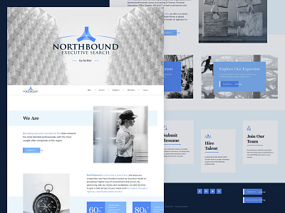
Executive recruitment firm - UX/UI design
Hey guys! 🤟
What you see above is a few screens of a website design i was working on for executive recruitment firm, based in New York.
Northbound Executive Search connects talented professionals with well-run organizations in and around New York City, on a permanent and temporary or consulting basis.
Goal
In terms of design, the goal was to make it as clean and intuitive as possible. The light look would give users the feeling of purity, order and cleanliness. Even though the design is very minimal and strictly "professional". Also, the design itself provides a combination of the right colors and proportions.
Solution
I analyzed the references and identified the pros and cons of UI and UX. Then a user-flow was created. The next step was to create an adaptive design and all inner pages, including text template and sitemap.
Eager to find out what you think of this!
Press "L" to show some love!
