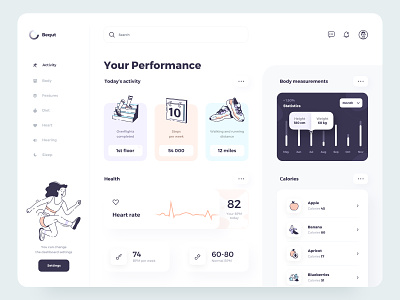
The Bequt dashboard user interface design
Dear friends,
To create a convenient, stylish, and intuitive dashboard, where the user can monitor the data that will be synchronized with different devices and, if possible, somehow influence them.
Goal — Our goal was to make the product as simple, clean, and stylish as possible. To work out the design and structure, new and useful functions in a simple understanding for users of different age groups and use illustrations.
Solution — after analyzing the market, conducting research, and interviewing a large number of people, we first solved the problem of “Bright and cartoon dashboards” of which there are a lot now. Still, they are not informative and carry only a visual component. We have combined style, simplicity, and illustrations with clear and straightforward functionality.
Design — Sketch
Illustrations — Illustrator
************
Don't forget to add ❤️ and Follow me
************
I am open to new projects! hey@migulko.cz


